Here are some highlights from the exhibition, to open between January 23–March 7, 2021.
When you look at a painting, you might concentrate on the forms depicted and their composition, the intensity of the brushstrokes, or the texture of the surface. You might also take in the piece as a whole or direct your gaze at a particular part that captures your attention. Among the many ways to appreciate paintings, one approach is to focus on color.
From early in his career, Genichiro Inokuma explored color schemes and the effects they created. Here are some quotes from his diary where he discusses color:
"I did a sketch and then applied colors roughly. This could develop into something interesting, but I may have trouble with the construction." January 10, 1933
"Now I finally understand the beauty of orange." February 14, 1933
"Completed the No. 50 canvas. I used the primary colors red, blue, and yellow. This work has potential." September 28, 1981
"I've rarely added this much color to a single painting. There's more to pay attention to than sparsely-hued works, which renders the painting process more interesting as I proceed. The painting gets dense, but I enjoyed experimenting while adding the finishing touches." January 14, 1983
"The balance between pink and green made for a beautiful space; this was a pleasant surprise." January 4, 1992
*The underlined words are unclear in the original text.
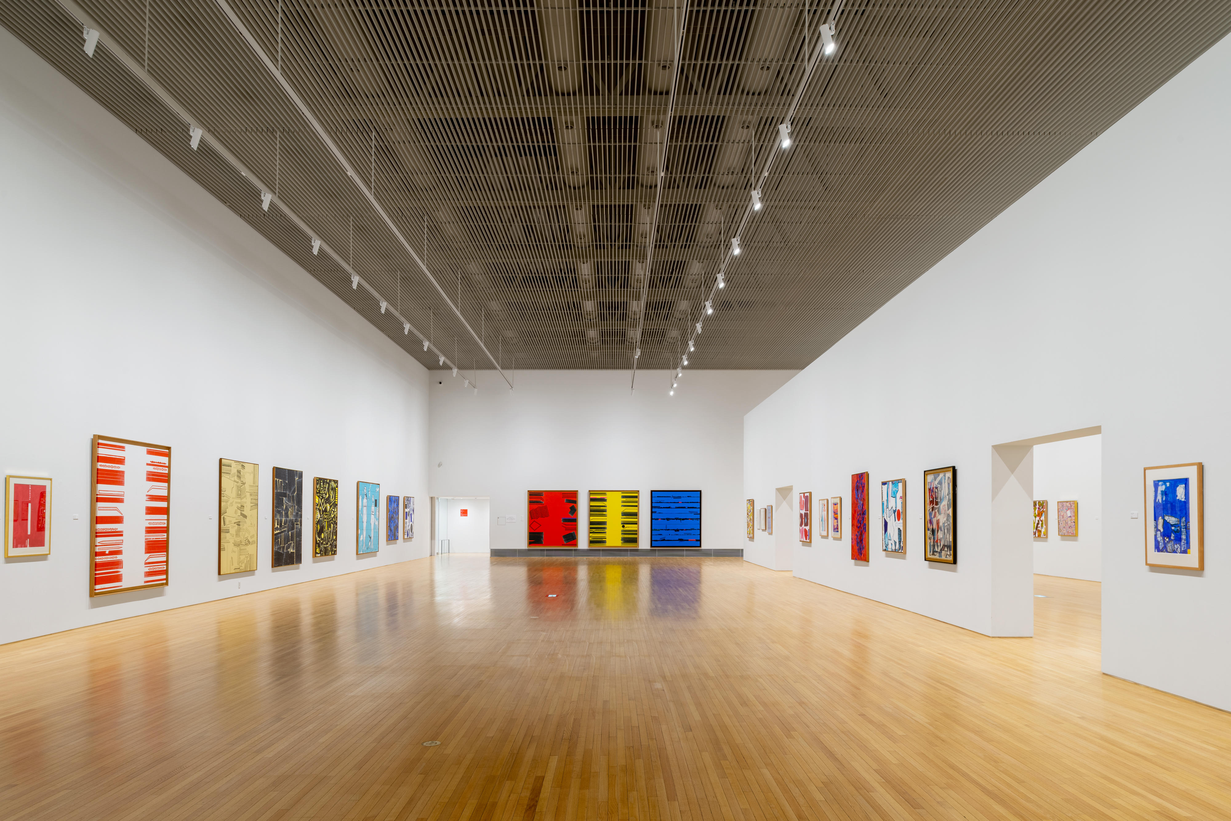
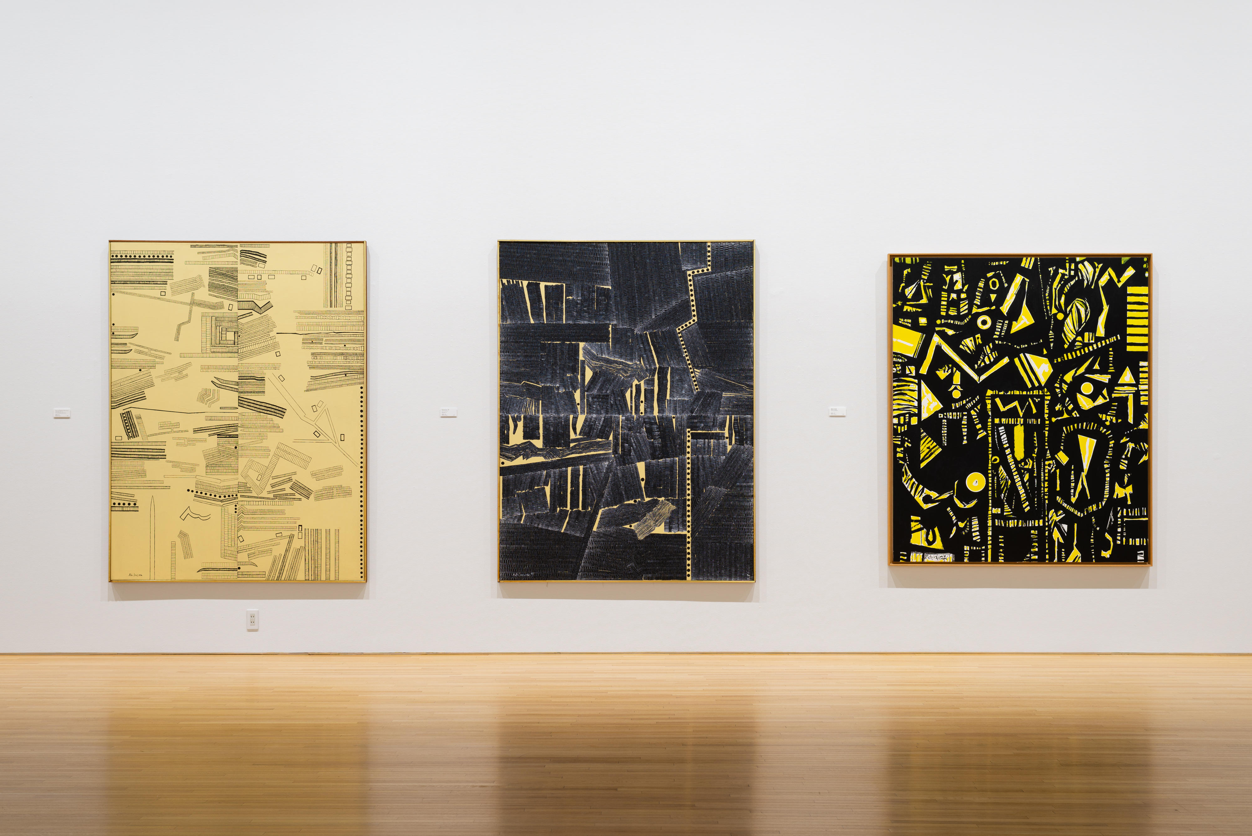
On display near the entrance are works in red, yellow, and blue, each combined with black and white pigments. Start your tour by taking in the beauty of the colors used in each painting and the contrast of hues between neighboring works.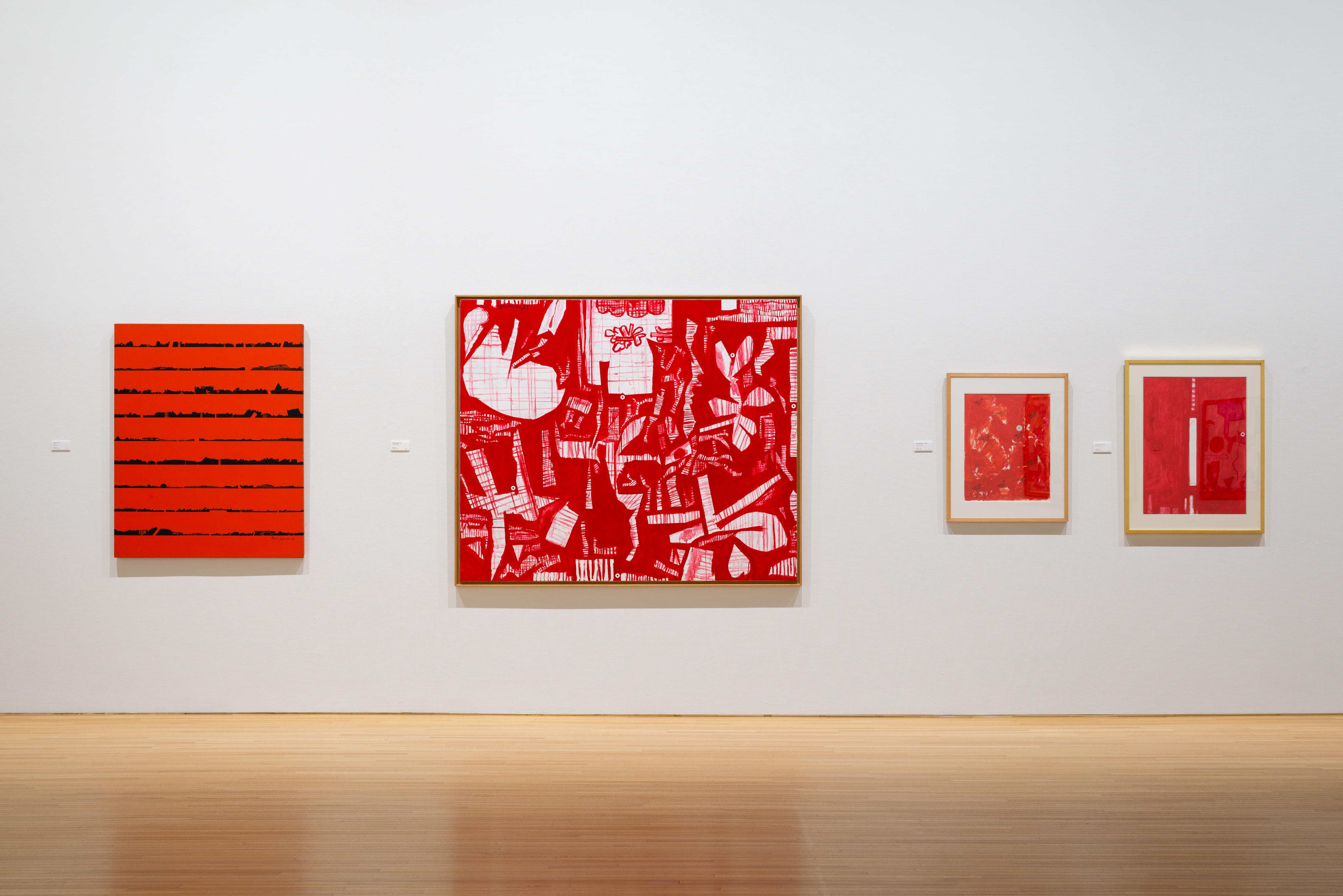
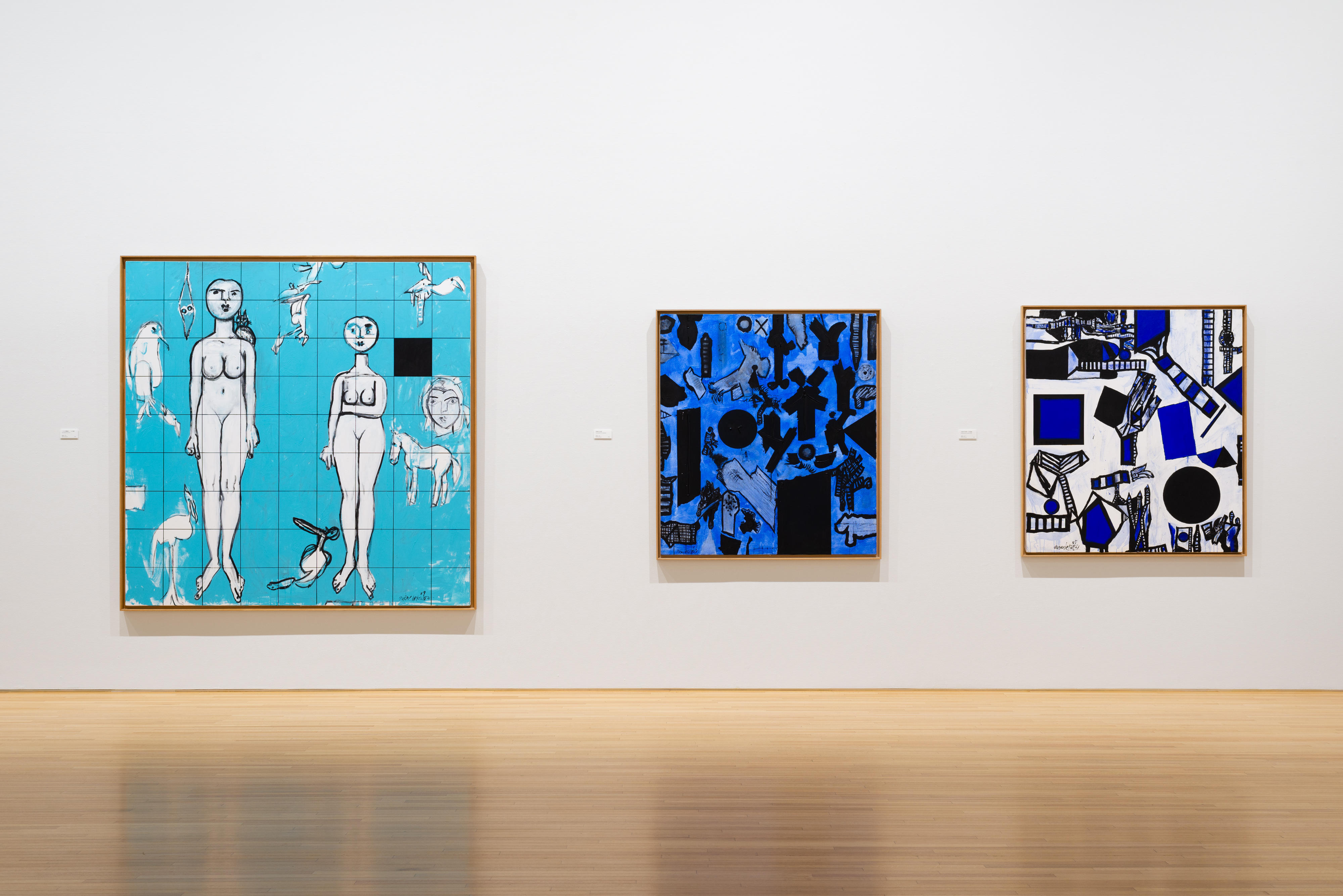
As you move along, the color palette increases, revealing to you the vivid uses of color typical of Inokuma's later pieces. You may have viewed paintings haphazardly in the past, but this exhibition will teach you the joy of discovering unexpected color schemes and savoring delightful contrasts and harmonies created by the chemistry of such colors.
Please note that all the works on display use color in equally exciting ways, but we decided to feature Two Gates (1987) on our posters and flyers because its shades of red, yellow, and blue stand out, perfectly representing the theme of our exhibition.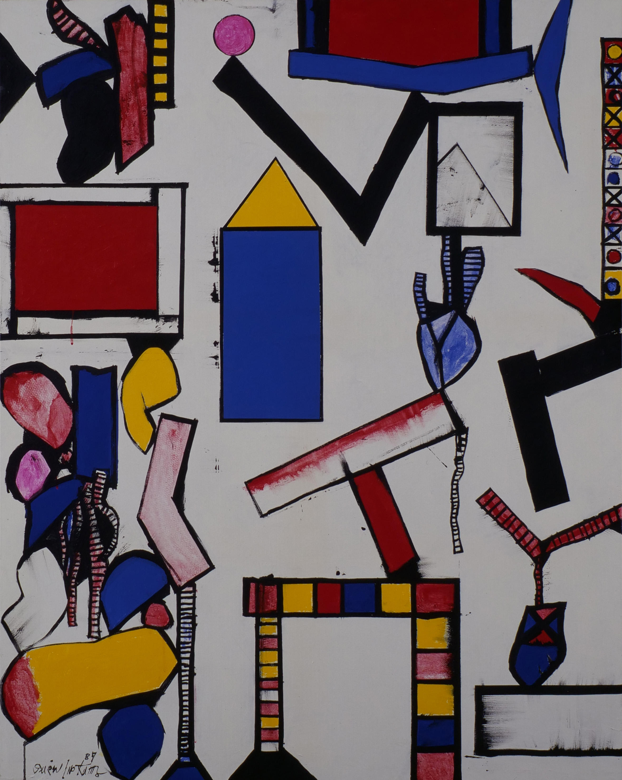
Genichiro Inokuma, Two Gates, 1987 ©The MIMOCA Foundation
Take a careful look at Two Gates when you visit the venue. What you initially see is just three primary colors, but you will gradually notice subtle differences among the hues. The pleasant surprise and delight you experience in these discoveries is perhaps one of the highlights of art appreciation. Focusing on colors and studying paintings in detail can open new doors and make for a more profound experience.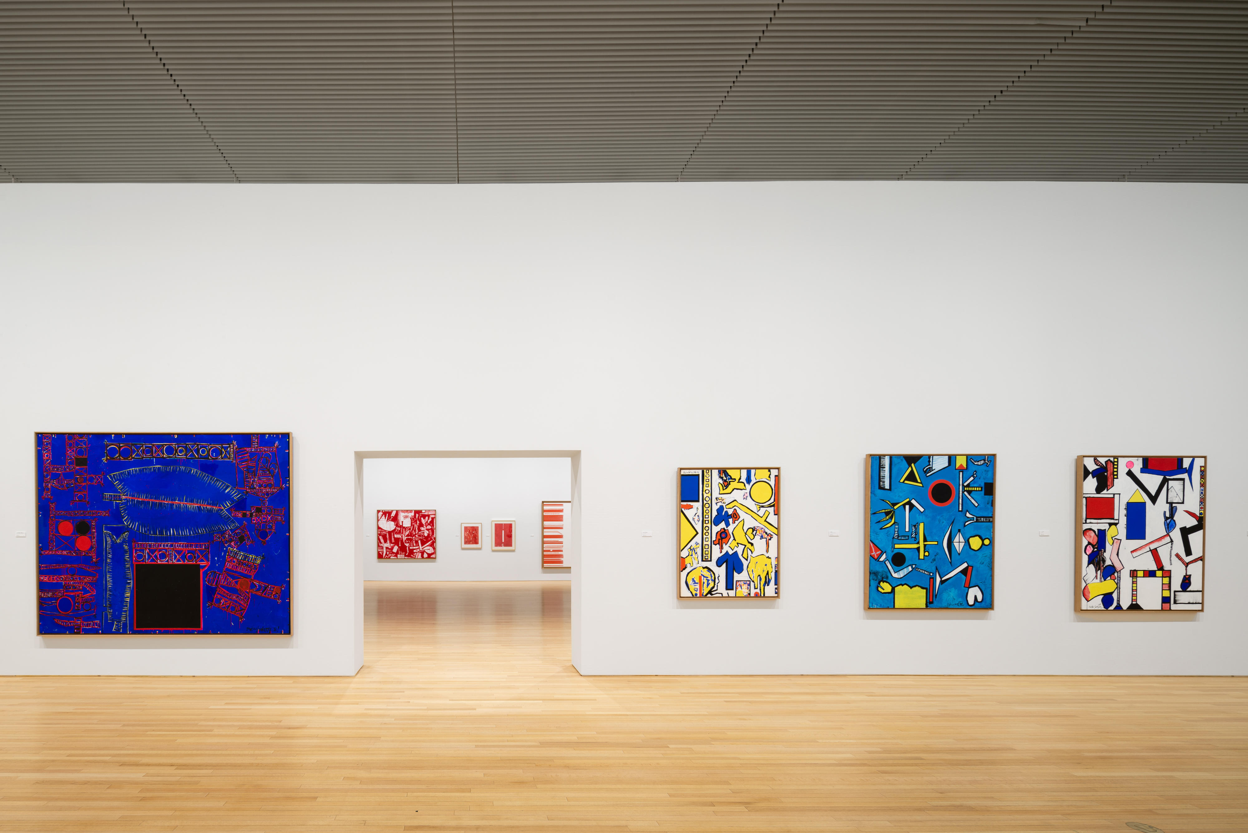
Photos of the exhibition room were taken by Yoshiro Masuda
Reproduction of photos from within this post is prohibited.